Best PracticesThe #1 rule for improving your presentation slides
by Tom Rielly • May 12, 2020
When giving presentations, either on a video conference call or in person, your slides, videos and graphics (or lack of them) can be an important element in helping you tell your story or express your idea. This is the first of a series of blog posts that will give you tips and tricks on how to perfect your visual presentations.
Your job as a presenter is to build your idea -- step-by-step -- in the minds of your audience members. One tool to do that is presentation graphics, such as slides and videos.
Why graphics for your presentation?
A common mistake is using slides or videos as a crutch, even if they don’t actually add anything to your presentation. Not all presentations need graphics. Lots of presentations work wonderfully with just one person standing on a stage telling a story, as demonstrated by many TED Talks.
You should only use slides if they serve a purpose: conveying scientific information, art, and things that are hard to explain without pictures. Once you have decided on using slides, you will have a number of decisions to make. We’ll help you with the basics of making a presentation that is, above all, clear and easy to understand. The most important thing to remember here is: less is more.
Less is so much more
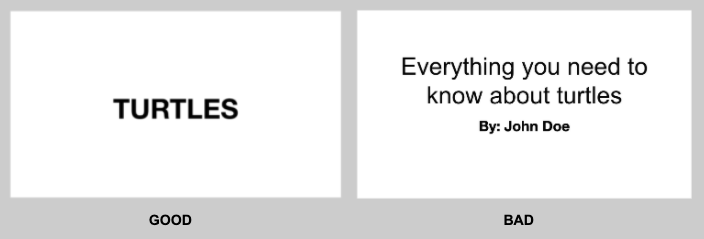
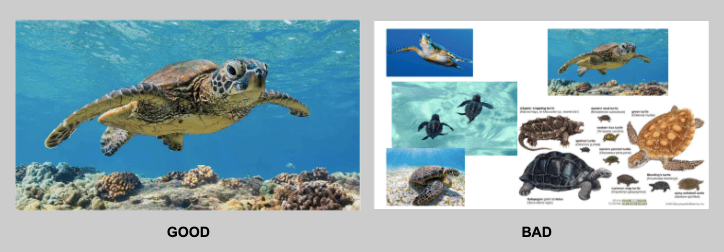
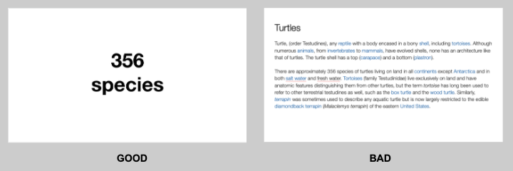
You want to aim for the fewest number of slides, the fewest number of photos, the fewest words per slide, the least cluttered slides and the most white space on your slides. This is the most violated slide rule, but it is the secret to success. Take a look at these examples.

As you can see in the above example, you don’t need fancy backgrounds or extra words to convey a simple concept. If you take “Everything you need to know about Turtles”, and delete “everything you need to know about” leaving just “turtles”, the slide has become much easier for your audience to read, and tells the story with economy.

The above example demonstrates that a single image that fills the entire screen is far more powerful than a slide cluttered with images. A slide with too many images may be detrimental to your presentation. The audience will spend more mental energy trying to sort through the clutter than listening to your presentation. If you need multiple images, then put each one on its own slide. Make each image high-resolution and have it fill the entire screen. If the photos are not the same dimensions as the screen, put them on a black background. Don’t use other colors, especially white.

Your slides will be much more effective if you use the fewest words, characters, and pictures needed to tell your story. Long paragraphs make the audience strain to read them, which means they are not paying attention to you. Your audience may even get stressed if you move on to your next slide before they’ve finished reading your paragraph. The best way to make sure the attention stays on you is to limit word count to no more than 10 words per slide. As presentation expert Nancy Duarte says “any slide with more than 10 words is a document.” If you really do need a longer explanation of something, handouts or follow-up emails are the way to go.
Following a “less is more” approach is one of the simplest things you can do to improve your presentation visuals and the impact of your presentation overall. Make sure your visuals add to your presentation rather than distract from it and get your message across.
Ready to learn more about how to make your presentation even better? Get TED Masterclass and develop your ideas into TED-style talks.